I've always been a big fan of interactive storytelling.
I regularly scroll through publications like The Pudding (my personal favorite) and Information is beautiful, hoping to see a new data-driven story that I can dissect.
Okay, I may be a bit of a data nerd, but I think good visuals always make for a more compelling story.
And despite what you might think, data journalism and visual storytelling are accessible to everyone, as long as you use the right tools.
So, to help you with that, I decided to share my favorite visual tools.
Let's start with the first one on my list:
1. Datawrapper
When it comes to displaying your data on a webpage, you can't beat the simplicity of Datawrapper.
With this tool, you can upload your dataset and turn it into interactive charts, maps, and tables that can be embedded anywhere. Best of all, it's free and you don't even have to register to use it (just go to this page and start using the tool)!
It is very easy to use and gives you a lot of visual options to display your data:
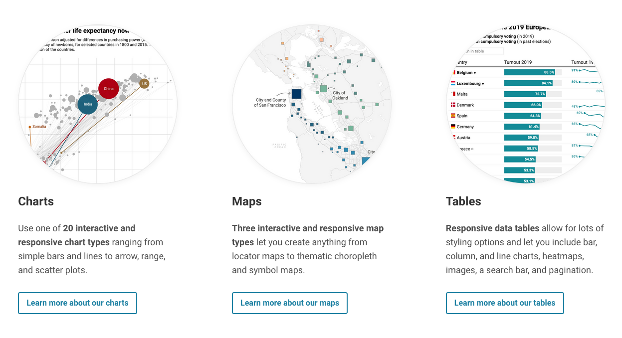
The applications are endless. Here's an example I picked up from their website:
2. Flourish
Flourish is the best alternative to Datawrapper, and does about the same thing, but with a bit more style.
It's free unless you need to collaborate with a team on your project, and as of 2022, Flourish has been acquired by Canva—one of my favorite tools—so you can expect a robust collaboration experience if that's what you need.
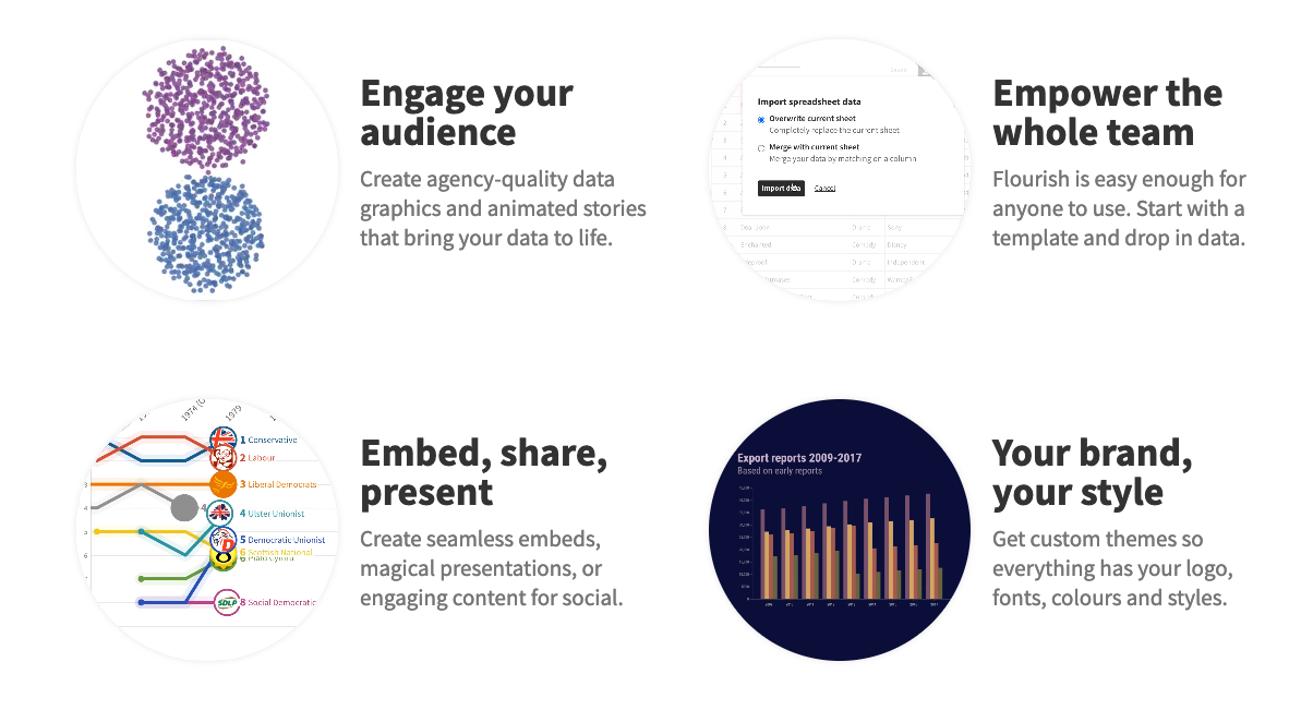
The main difference with Datawrapper is the look of the charts and maps. Personally, I find that Flourish looks a bit more modern and you can do some fancy animations with ease.
Here’s an example:
3. PamPam
Flourish and Datawrapper are great options for making maps with lots of data, but I recently came across a cool alternative for user-friendly maps called PamPam.
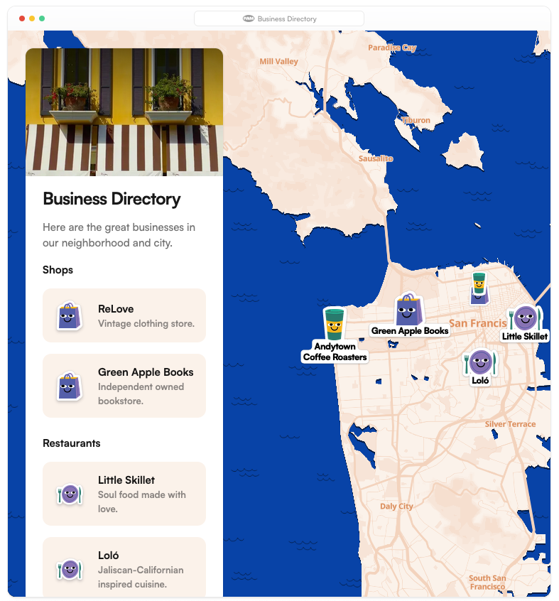
The concept is basically to put stickers on a map to make it interactive.
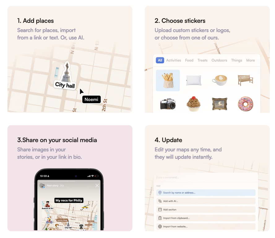
You can make 5 maps for free as long as you don't get more than 500 views per month, but this might get you started if you want a fun map that doesn't get too much traffic.
Here’s an example of what you can do:
4. QGIS
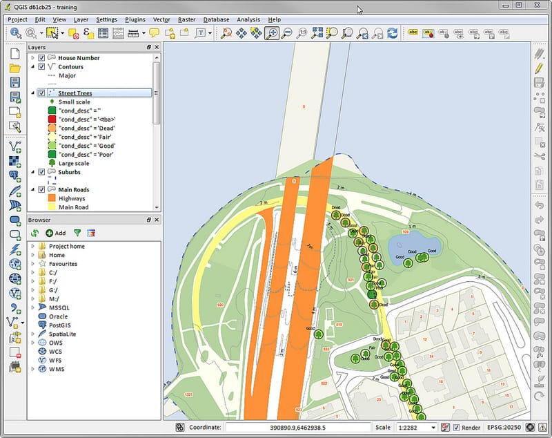
Now, if you are looking for professional-grade maps, QGIS is the way to go.
QGIS is a free open source software that uses the Geographic Information System (GIS) standard, which is basically the common data system that most professionals use to create maps
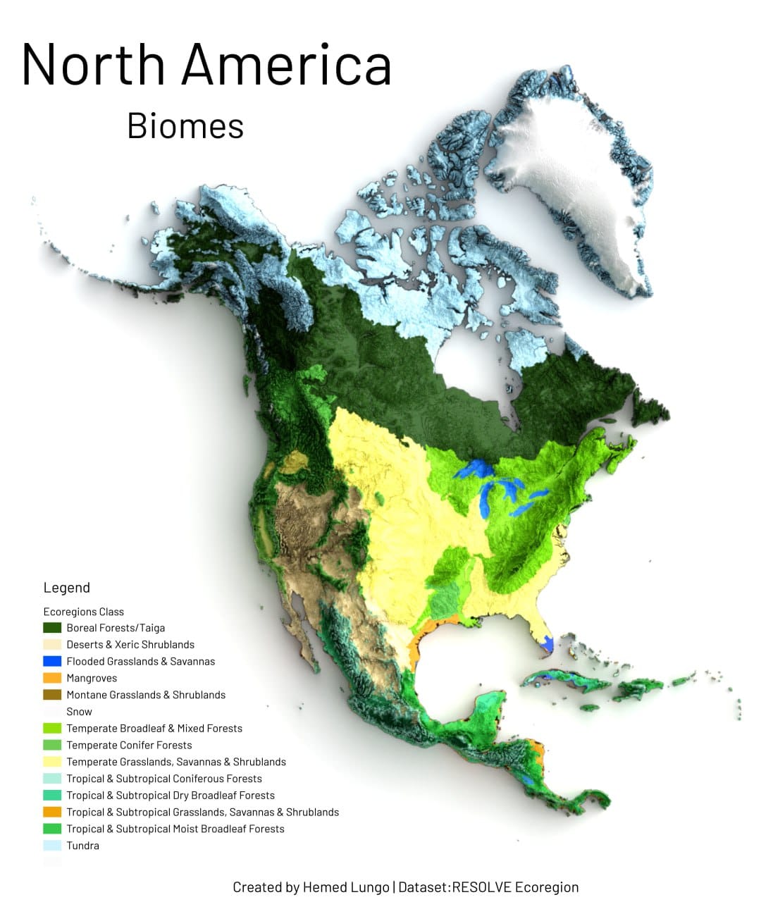
The great thing about this kind of solution is that you can easily play with topography and terrain to create sick looking maps like this one:
The only inconvenience with QGIS is that it takes a bit of training to get the hang of it, but since it's open source, there's a huge community supporting the software with tons of resources and plugins you can add to it.
If you're interested in these types of maps, but prefer to play with more modern tools, look no further than the next one on the list.
5. Felt
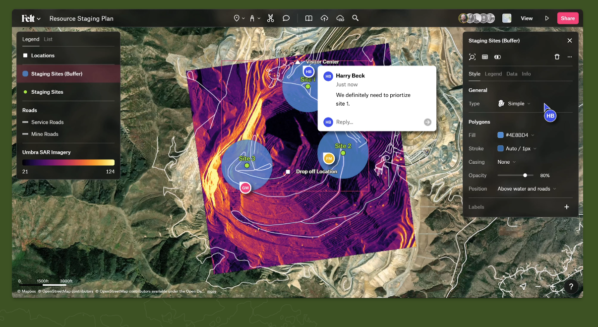
Felt is basically a user-friendly web-based version of QGIS that allows you to collaborate and share your maps more easily.
Unlike the open source QGIS, Felt also has paid plans, but the free one offers unlimited maps, so the only reason to upgrade is to access the team-sharing features.
The interface is more approachable than QGIS in my opinion:
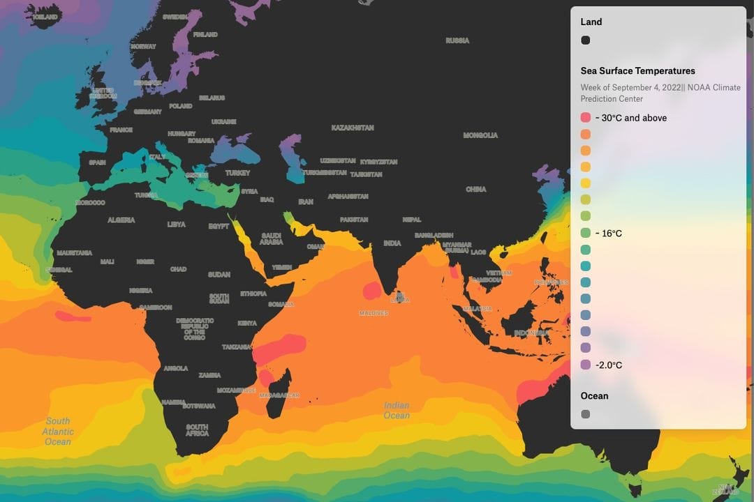
And you can do pretty much the same thing, so it's a powerful solution for merging complex geographic data with nice-looking maps:
6. ColorBrewer
While we're on the subject of maps, here's a quick tool to make your maps look even better: ColorBrewer.
ColorBrewer helps you find colorblind friendly palettes to use on your maps.
Check out this example:
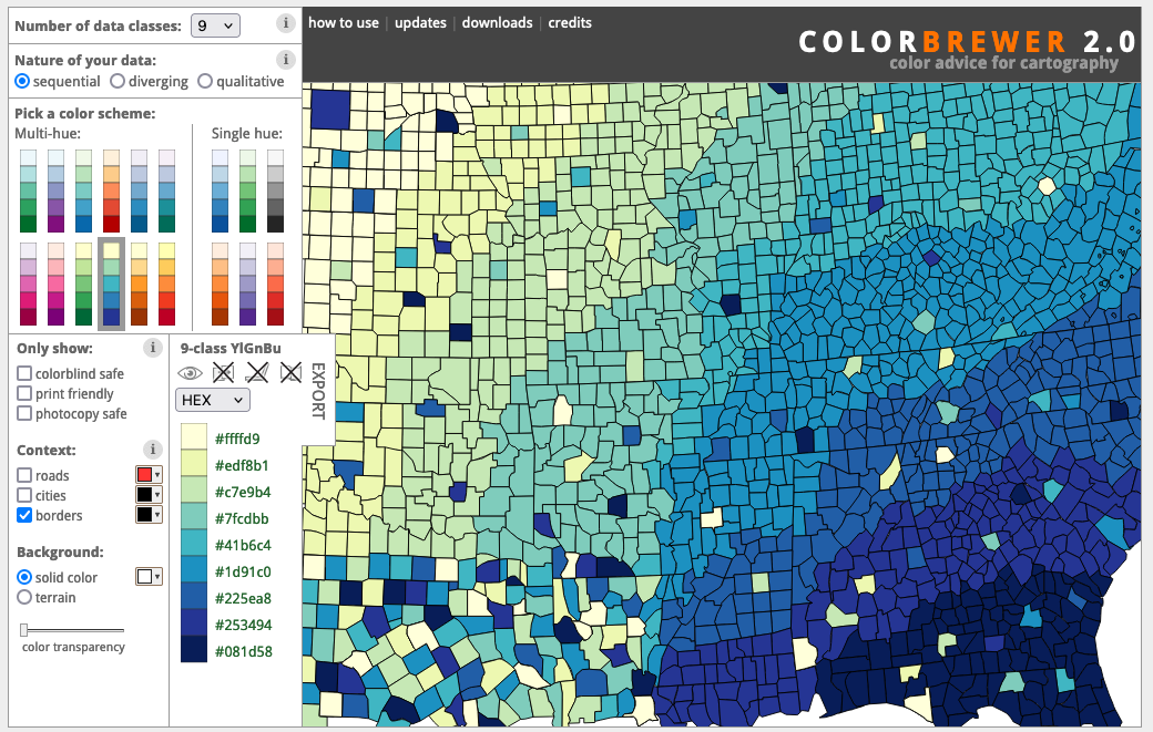
There are 9 different colors on this map, but despite the complexity, you can easily distinguish each and every color in the lower left corner of the map (the most dense area of variation), even if you have trouble distinguishing colors.
This is a great way to make your maps, or even your charts, more accessible.
7. Miro
Now let's move on to something completely different: mind mapping.
There is no better way to illustrate a complex hierarchy than using mind mapping, and for this kind of visualization I find Miro to be a great solution.
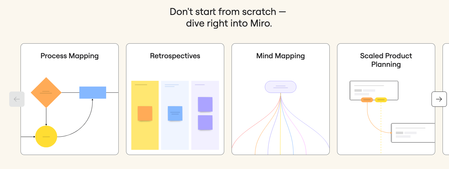
You can get started with 3 boards for free before you have to pay anything, and what's great is that unlike other competitors, Miro gives you access to pretty much all the features right out of the box.
Miro doesn't just offer mind mapping, it also lets you be more creative with whiteboards, process mapping, technical diagrams and many more options.
What's really cool about Miro is that because it works as a whiteboard, you can go beyond just mind mapping and find creative ways to tell a story.
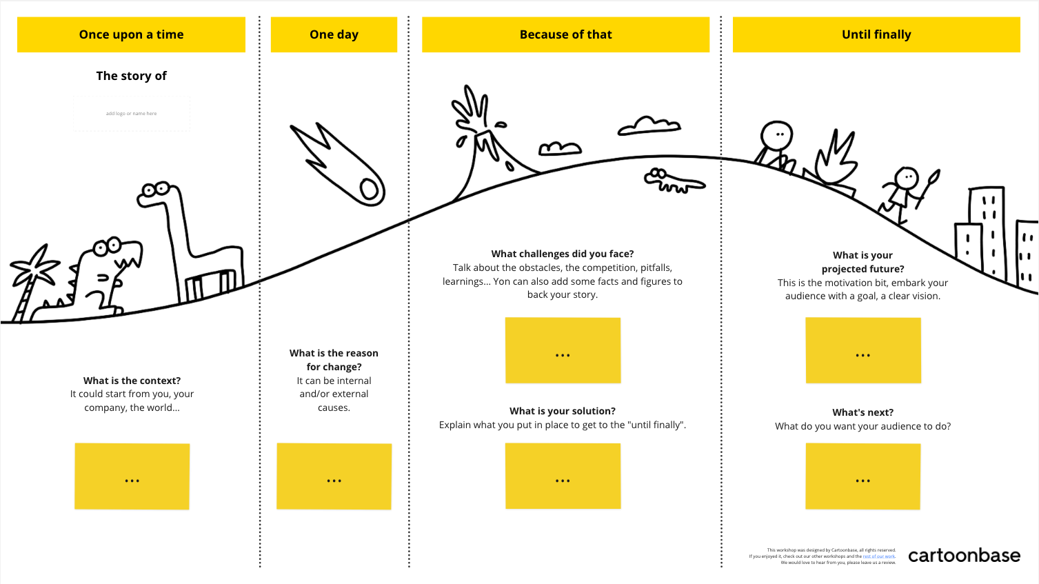
Plus, you can find a ton of templates to help you get started, like this one:
8. Airtable
When it comes to sharing online databases, Airtable has long been my favorite.
I've always found it's user-friendly and fast interface much better than going through an Excel file, and the fact that you can embed a database anywhere makes it a great tool for letting people navigate your data on their own.
When embedded, databases can be easily searched, filtered, and sorted by users, which I know is hard to replicate with other tools.
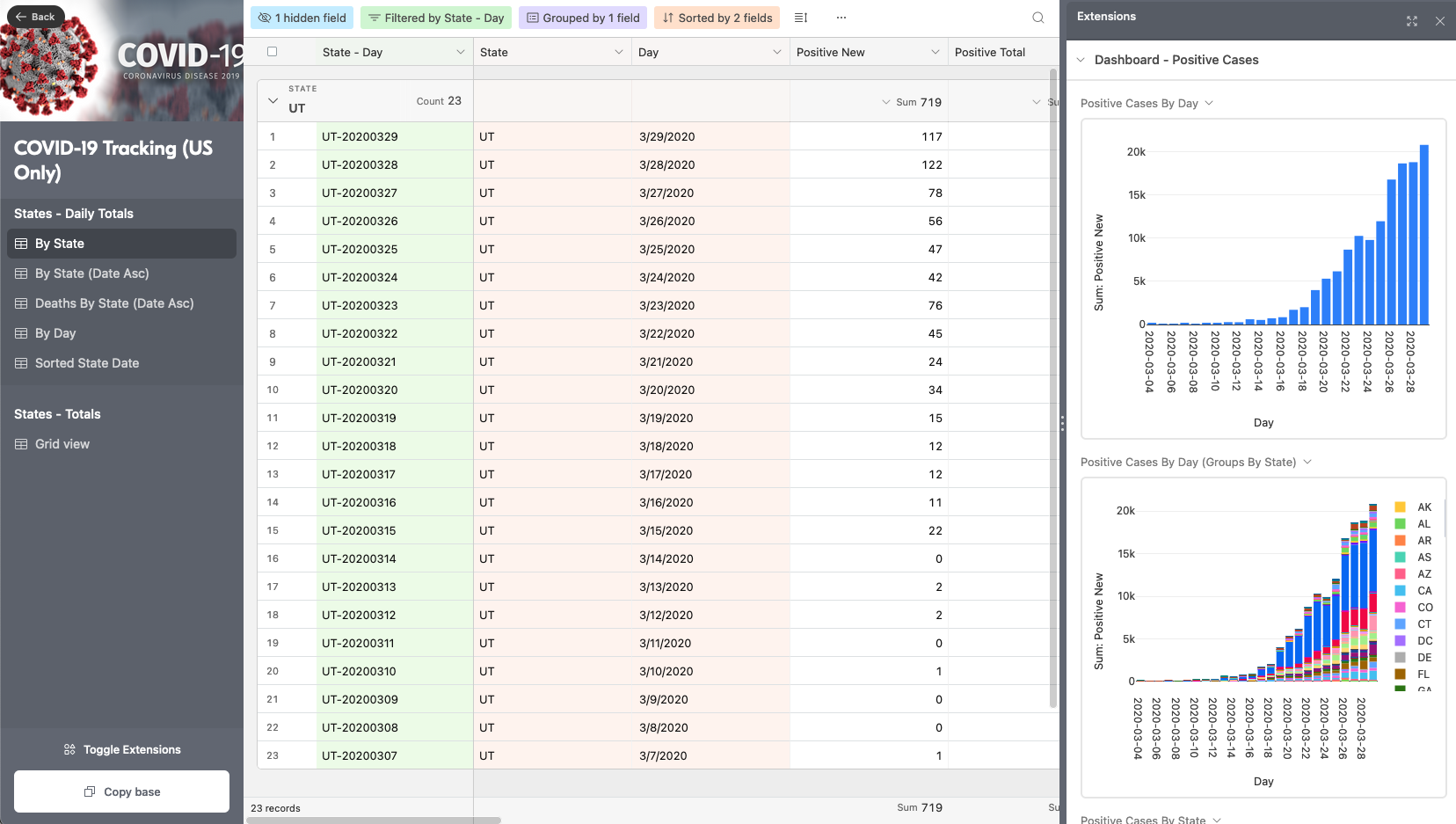
Airtable has also developed a lot of new features, like extensions to show you data as graphs, or the ability to build no-code apps from your database (which is a great way to create a collaborative tool).
Here’s an example of what you can build:
9. How Big
I never understood why journalists keep using " football fields" as a way to measure things. First of all, you never know if they're talking about American football or soccer, which have very different field sizes, and then soccer fields can vary in size as well, so... what's the point?
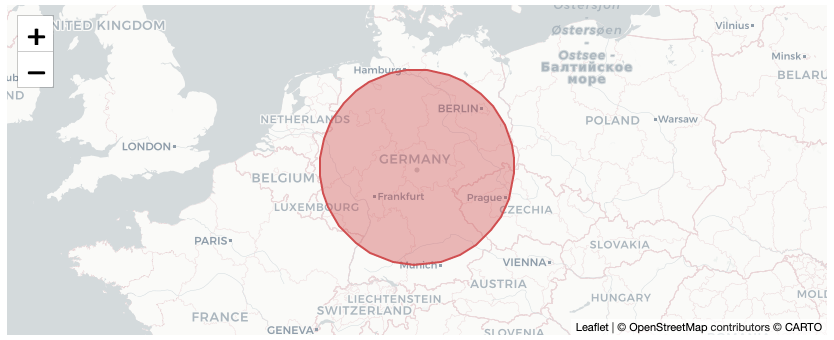
Fortunately, you can now use How Big to compare the area you want to describe to actual countries on the map, which is a much more relatable measure.
To give you an example, here's how Mount Olympus on Mars, the largest volcano in the solar system, compares in size to a country like Germany:
10. Shorthand
Static websites are fine in most cases, but sometimes you want your page to do more than just be blocks of text.
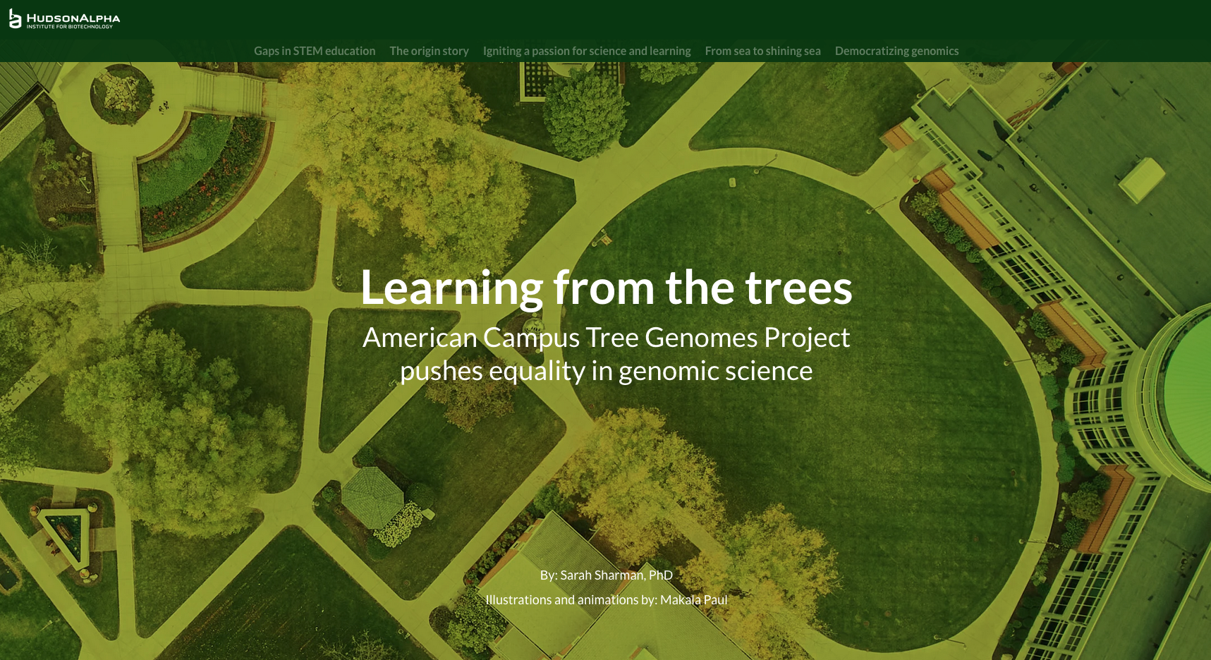
Scrollytelling is the art of using scrolling to tell a story, and for this, you can use Shorthand.
As you scroll through the page, images appear and can be animated in a way that tells more than just words.
Shorthand only gives you the option to create one story for free, but it's a good way to try out this way of communicating before thinking about doing more (and anyway, I think this tool should really be kept for stories that justify the need for scrollytelling).
You could pretty much do the same thing on your own site, but you'd probably need a developer to make it look nice, whereas Shorthand lets you do it without any code
Here’s an example I found:
11. Timeline
The Knight Lab at Northwestern University has developed a number of really cool tools to help journalists tell better stories.
One of them is Timeline, a tool that lets you create and embed an interactive timeline on your website.
It’s open source and crazy easy to use with just a Google Sheet (instructions are on the page).
Here’s an example of what you can do:
Bonus: Storymap is another tool from the Knight Lab and lets you do pretty much the same thing as Timeline, but over a map.
12. Juxtapose
The Knight Lab has been busy developing tools, and another of my favorites is Juxtapose.
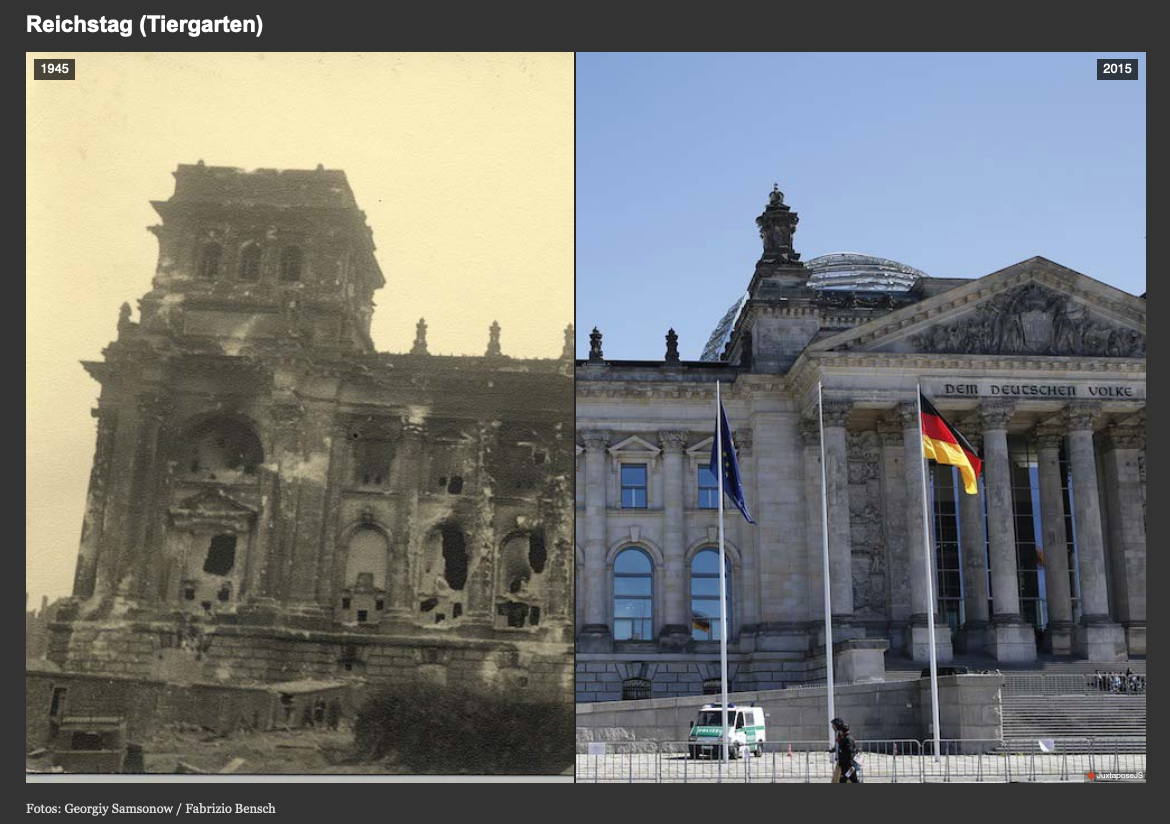
As the name suggests, this tool lets you compare two images with an interactive slider. It's great for before/after effects like this one:
Again, this tool is very easy to use and totally free.
This is the last tool on my list, but I'm sure there are many more cool solutions out there.
If you'd like to add one to the list, feel free to contact me and I'd be happy to take a look.
And if you find creative ways to use these tools to tell cool stories, let me know, I'd love to feature them on my website!


